WebQuest
WPAP (Wedha’s Pop Art Potrait) [GUIDE]
Process

Search for sites and links listed in this page in order to learn how to make a WPAP. There are many other sites you can use if you want to search on your own. The sites and links I suggest are:
https://kelasdesain.com/tutorial-membuat-wpap-dengan-coreldraw/
https://www.youtube.com/watch?v=HH-WI9B1f2U
There is a link listed for each step, this will help you cover the relevant step, yet that particular link can be used again in the future in order to make WPAP.
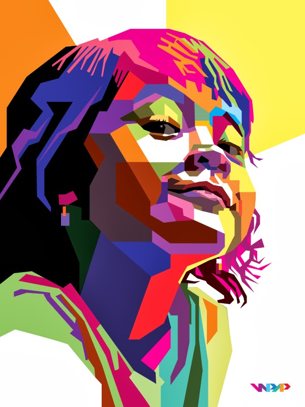
[Reference tittle pic : By me]
Now prepare your Laptop, and give it a try!
STEP 1 : The Faceting Process
In the faceting process, by tracing the image, I divide human faces into aspects. Each side (plane) is formed based on the different levels of dark and light areas seen in the original photo. Each side is formed by straight lines, not curved lines. This is because the aspects formed by straight lines will appear stronger in terms of shapes formed by curved lines.
PIC : http://3.bp.blogspot.com/-5xtyigzU4uo/UtLbswa_TZI/AAAAAAAADYs/6j3oQyAoLnI/s1600/wpap_1.jpg
STEP 2 : Coloring Process
In coloring, to show something stronger, I only use flat colors, not gradual colors. Even though the colors look as if they are colliding with each other, efforts must be made to make it look three-dimensional.
PIC : same as tittle picture
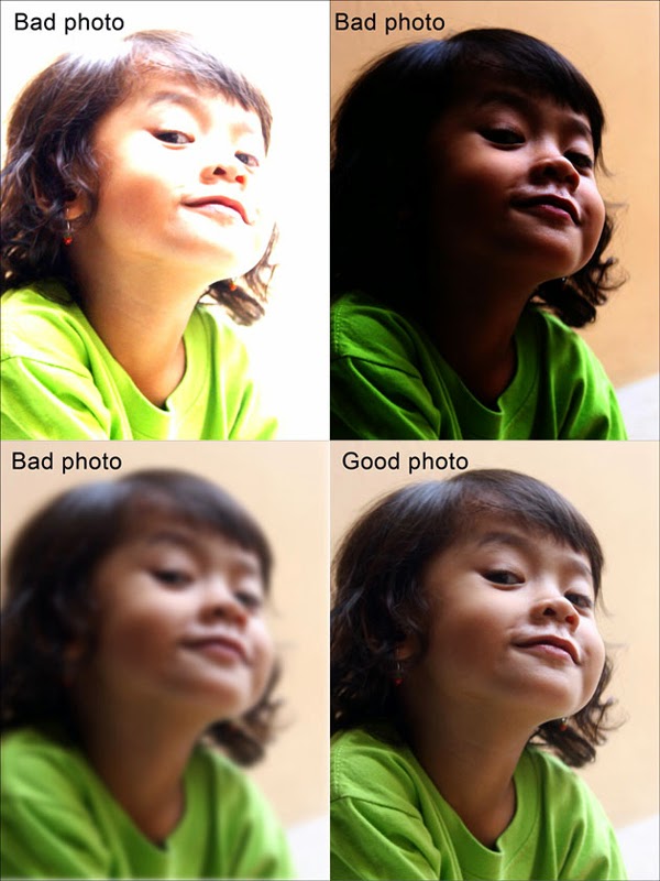
STEP 3 : Prepare your file (Photo)
The faceting process is based on photo tracing. So this photo selection is important because photos that are good in quality, image sharpness, lighting and resolution, will help you to make a good final rendering of a WPAP piece.
PIC : http://3.bp.blogspot.com/-O2cjbzY2j8U/UtLcRfO4sFI/AAAAAAAADY4/BnY17EvYZdE/s1600/wpap_2.jpg
THE PROCESS
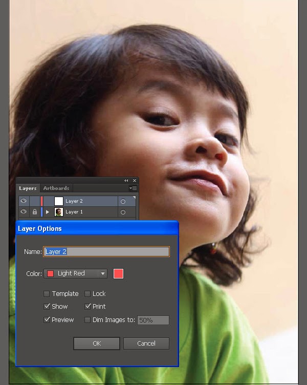
1. Open Adobe Illustrator and create a new document (File> New). Set the size and other settings as shown below.
PIC : http://1.bp.blogspot.com/-zp8G51ASvg4/UtLcypQTh-I/AAAAAAAADZA/1Tyhg8vKp1E/s1600/wpap_3.jpg
2. Go to File> Place and find your image reference and place it on your artboard. Lock the photo layer contained in and then Create a New Layer above the photo. This is where you will draw your faceted shapes.
PIC : http://4.bp.blogspot.com/-7q-Z5U6V1p0/UtLdJkWy_pI/AAAAAAAADZI/NaZegxblypY/s1600/wpap_4.jpg
STEP 4 : Create Your First Form
I usually start the search process by selecting an area with a clear boundary between dark and bright areas. This is so that I can easily do tracking. And the smallest part is usually my first choice. In this case, the eyes and the surrounding area.
1.) Using the Rectangle Tool (M), I trace the highlight on the iris, which still appears vaguely in the photo. This form has filling without a stroke. All objects created will be in this style.
PIC : http://3.bp.blogspot.com/-ucOb75CQEnw/UtLdfVoI43I/AAAAAAAADZQ/9KmuRzEp898/s1600/wpap_5.jpg
2.) In the original photo, the iris, purple and the eyelids of the tip have a dark and clear color to which you can determine the edges of this shape. I will browse this section, this time I will use the Pen Tool (P).
PIC : http://1.bp.blogspot.com/-rbA9SZbfnic/UtLdupJE2oI/AAAAAAAADZY/Fjdchhsdl1M/s1600/wpap_6.jpg
3.) To make it visible, while the iris and eyelid are still active, you will need to rearrange your shape by going to Object> Arrange> Send to Back
PIC : http://2.bp.blogspot.com/-MpBX_21-SxU/UtLd7gR70ZI/AAAAAAAADZg/rDuq0qe2gU0/s1600/wpap_7.jpg
4.) Create More Complex Shapes
Trace the next closest area to the previous object. Unfortunately, we have here a clear and lively boundary between the dark and bright areas. This makes it more difficult to create shapes for portraits.
PIC : http://2.bp.blogspot.com/-XJPfk2daU6E/UtLeOqO666I/AAAAAAAADZo/NxYM8wnTRwI/s1600/wpap_8.jpg
5.) Make straight-edged shapes along the corners of the eyelid, making sure you overlap the shapes for the eyes so they don't leave any gaps between the shapes. Then as before, rearrange the shape by going to Object> Arrange> Send to Back
PIC : http://4.bp.blogspot.com/-hBdfq7pkDAM/UtLet9vSmQI/AAAAAAAADZw/plO1uvNPBqs/s1600/wpap_10.jpg
6.) Notice how I make a shape that is not too square and distorted so that it shows a dark shadow cast from the lashes. You will find the same shape as long as using the same method.
PIC : http://2.bp.blogspot.com/-rf0qXKcZmVQ/UtLe4o3sVXI/AAAAAAAADZ4/vk03wNO7mvA/s1600/wpap_11.jpg
7.) This is a problem you will find again and again. This might be a tedious and tedious process, but it is the only way to create the right WPAP composition. You might think of using posterizing or Live Trace, but no, I don't use these facilities because they don't create the same style.
PIC : http://2.bp.blogspot.com/-QcRTGobeoos/UtLfNU3gfJI/AAAAAAAADaA/H8-DaR9gdA8/s1600/wpap_12.jpg
8.) Still find unclear and even invisible boundaries for every potential form. The best way to overcome this problem is through the experience of repeatedly creating art in this style.
This process is duplicated throughout:
-Draw shapes with the Pen Tool (P) using only straight lines.
-Fill in the appropriate color given the exposure to light.
-Select the shape and arrange it by going to Object> Arrange> Send to Back.
PIC : http://2.bp.blogspot.com/-cxzSjJ_0yuQ/UtLfeZWuM1I/AAAAAAAADaI/9i4qv_etosE/s1600/wpap_13.jpg
8.) Connect areas with shapes and add white shapes to regions under extreme light.
PIC : http://1.bp.blogspot.com/-CF14LWM2lIE/UtLfsyDQDII/AAAAAAAADaQ/hXQG7kj3gfE/s1600/wpap_14.jpg
9.) Use larger shapes in less detailed areas, such as cheeks and neck.
PIC : http://1.bp.blogspot.com/-Jgan0P7iopA/UtLf7Pk09aI/AAAAAAAADaY/8XRpUtTFn-M/s1600/wpap_15.jpg
10.) The hair starts with thin, parallel shapes on the diagonal. Remember to avoid using curves at all costs. As you can see, I like making aspects with vertical or horizontal sides. This will strengthen the overall composition and style. My priority is always the resemblance of faces, this is the most important element of portraiture.
PIC : http://2.bp.blogspot.com/-u4PyzWXYMMw/UtLgILq31_I/AAAAAAAADag/fqcgO9hPy8M/s1600/wpap_16.jpg
11.) After several revisions, this is my final artwork. Choosing the right color is the most difficult part of the WPAP process. This can be a difficult element to understand when working with style as a beginner.
PIC : http://1.bp.blogspot.com/-5FB-Xj0yLJU/UtLbOZLpaYI/AAAAAAAADYo/iSlD1JIUKaY/s1600/wpap_final.jpg
REFERENCE STEP + PICTURE LINK :
https://kelasdesain.com/tutorial-membuat-wpap-dengan-coreldraw/
http://anindyahrp.blogspot.co.id/2014/11/tutorial-membuat-wpap-dengan-coreldraw.html
The Public URL for this WebQuest:
http://zunal.com/webquest.php?w=645978
WebQuest Hits: 617
Save WebQuest as PDF


